Beyond the Basics: Exploring Unique Abstract Wall Art Styles
Most people’s idea of “abstract art” starts and ends with a few splashes of paint on a canvas. Fair enough — that’s the version that gets the most attention. But abstract art actually covers a lot more ground than that, and once you start looking past the obvious stuff, there’s a whole world of styles that don’t get nearly enough credit. Some are bold and chaotic. Others are so quiet you almost miss them. Both can completely change how a room feels.
Why “Abstract” Covers So Much More Than You’d Think
The word abstract just means the art doesn’t depict something realistic. That’s it. It’s not tied to one look, one color palette, or one technique. That’s actually why it’s such a flexible category — a huge, colorful, chaotic piece and a tiny, quiet, single-line drawing can both technically be called abstract, even though they couldn’t look more different hanging on a wall.
This is part of why so many people default to the same handful of “safe” abstract pieces when decorating. They don’t realize how much variety actually exists within the category, so they just pick whatever shows up first in a search.
Lesser-Known Abstract Styles Worth Knowing
Gestural Abstraction
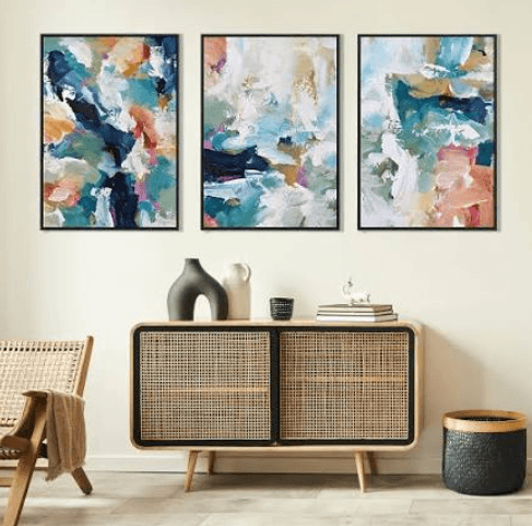
This is the loose, expressive, almost chaotic-looking style — big sweeping brushstrokes, visible motion, energy captured right on the canvas. It’s less about a “finished” composition and more about capturing a moment of movement. Works well if you want a piece that feels alive rather than static.
Geometric Abstraction
The opposite end of the spectrum. Sharp lines, defined shapes, often built around a grid or repeating pattern. This style tends to feel more controlled and intentional, which makes it a good fit for spaces that already lean modern or architectural.
Color Field Painting
Large areas of a single color or a small handful of tones, with very little detail beyond that. It sounds simple, almost too simple, but in person these pieces have a surprising amount of presence. The scale and color do all the work instead of any intricate detail.
Textural Abstraction
This style leans on physical texture — raised surfaces, mixed media, layered materials — rather than relying purely on color or shape. It’s less about what the piece depicts and more about what it feels like, even just visually.
Biomorphic Abstraction
Soft, organic, curved shapes that hint at natural forms without depicting anything specific. Think shapes that feel like they could be a leaf, a wave, or a cell, without committing to any of those exactly. It reads as calmer and more approachable than sharp geometric work.
If you want to see how varied this category actually gets, browsing a full range of modern abstract paintings makes it obvious pretty quickly — the difference between a bold color field piece and a quiet biomorphic one is huge, even though both technically fall under the same “abstract” label.
How to Pick a Style That Actually Fits Your Space
Think About the Energy You Want in the Room
Gestural and geometric styles tend to bring more energy and movement into a space. Color field and biomorphic pieces feel calmer and quieter. Neither is right or wrong — it depends on whether the room already has a lot going on, or whether it needs a little more life.
Match It to Your Existing Furniture Style
Sharp, geometric furniture pairs naturally with geometric abstraction. Soft, curved furniture (think rounded sofas, organic shapes) tends to look better next to biomorphic or gestural pieces. It’s not a strict rule, but mismatched sharp-and-soft can feel a little disjointed if you’re not careful.
Don’t Ignore Scale
A small, detailed gestural piece can get completely lost on a big wall. A huge color field piece can overwhelm a tiny room. Bigger walls generally call for either a bigger piece or a small grouping, while smaller spaces usually do better with one well-chosen, appropriately sized piece.
Minimalist Abstract: The Quietest Style of All
Within this whole world of abstract art, there’s a subcategory that deserves its own mention — minimalist abstract work. It strips things down even further than color field painting, often relying on just one or two simple shapes and a huge amount of empty space around them. It’s not trying to say much. That restraint is actually the whole point.
A piece like this minimalist canvas art shows what that looks like in practice — a composition built around balance and negative space rather than detail or color intensity. It’s a good example of how “less” can still carry real visual weight in a room, especially when everything else around it is a bit busier.
Mixing Different Abstract Styles in One Home
You don’t have to commit to just one style throughout your whole house. A lot of the most interesting homes mix a bold gestural piece in the living room with something quieter and more minimal in a bedroom or hallway. The contrast actually helps each piece stand out more than if everything matched perfectly.
The one thing to watch for is overcrowding a single room with too many competing abstract styles. A bold color field piece and a busy gestural piece in the same small space can start to fight each other visually. Give each style its own room, or at least its own wall, to actually breathe.
Where Different Styles Work Best
Gestural and geometric pieces tend to do well in living rooms and home offices, where a bit of energy and visual interest is welcome.
Color field and biomorphic pieces suit bedrooms and reading nooks, spaces where you want the art to feel calming rather than stimulating.
Minimalist abstract works almost anywhere, honestly, since it takes up so little visual “noise.” It’s a safe choice for smaller spaces or transitional areas like hallways.
See also: Key Features of Effective Small Business Inventory Management
FAQ
How do I know which abstract style fits my personality, not just my decor?
Pay attention to what you’re drawn to when you’re just scrolling casually, not shopping with intent. People usually gravitate toward the same energy level — bold and expressive, or quiet and restrained — pretty consistently, even across totally different rooms in their home.
Can I mix bold abstract art with minimalist abstract pieces in the same house?
Yes, and it often works really well. Just try to keep them in separate rooms or at least separate walls, rather than placing a loud gestural piece right next to a quiet minimalist one — that contrast can feel jarring up close, even though it works fine across a whole home.
Is minimalist abstract art too plain for a large statement wall?
Not necessarily. A minimalist piece scaled up large enough can still make a strong statement — the empty space around a simple shape actually becomes more dramatic at a bigger size, not less.
Abstract art isn’t one single look, and it never really was. Once you start exploring past the obvious, bold-and-colorful default, there’s a surprising amount of range to work with — quiet or loud, sharp or soft, simple or complex. The right one just depends on what kind of energy you actually want living on your wall.